Positive Energy Vastu Kitchen Colours
Positive energy is often associated with comfort, warmth, and emotional balance within a home, and the kitchen plays a central role in shaping that atmosphere. As the space where nourishment is prepared and shared, its environment influences daily mood and family interaction. In vastu-inspired interior decoration, colour selection is considered an important factor that affects perception, harmony, and visual flow.This approach is increasingly reflected in interior design in Kolkata, where homeowners blend traditional vastu awareness with modern aesthetics to create balanced and welcoming kitchens.
Beyond traditional beliefs, modern design psychology also supports the idea that colours impact how people experience a space. Warm tones can uplift, neutrals can calm, and balanced palettes create cohesion. Choosing suitable colours therefore becomes both an aesthetic and emotional decision. By combining mindful colour choices with contemporary interior styling, homeowners can design kitchens that feel welcoming, functional, and visually pleasing.
Why Colour Selection Matters in Kitchen Design
Colour influences more than appearance — it affects spatial perception, lighting reflection, and psychological comfort. Light shades make compact kitchens feel larger, while warm hues enhance liveliness. Balanced colour schemes also support better focus and productivity during everyday tasks.
Interior decorators often treat colour as a foundational layer of design. It guides the choice of materials, cabinetry finishes, and accessories. When aligned with thoughtful planning, colour selection helps create consistency between traditional guidance and modern lifestyle needs. This approach ensures kitchens remain both practical and emotionally engaging.
Best Colour Choices to Encourage Harmony
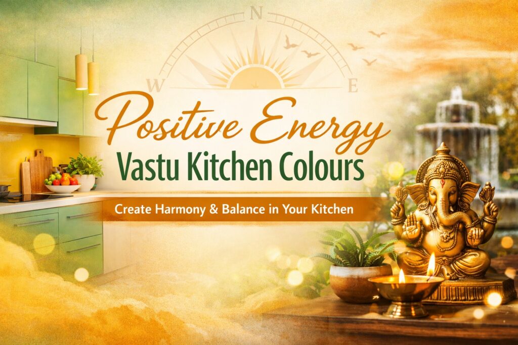
Warm Yellows and Soft Oranges
Yellow and orange tones introduce brightness and optimism. They reflect natural light effectively and bring warmth into the cooking environment. Subtle application — such as backsplashes or accent walls — keeps the space energetic without overwhelming the senses. These shades pair well with wooden finishes or matte neutral surfaces, making them adaptable across interior styles.
Fresh Green Shades
Green symbolises freshness and renewal. Soft greens, sage tones, or muted pastels create calmness while maintaining visual sophistication. They work especially well in modular kitchens where clean lines dominate, adding organic balance to structured layouts.
Light Neutral Tones
Cream, beige, and earthy whites provide grounding stability. They allow flexibility in decorating and easily complement evolving trends or seasonal updates. Neutral palettes also enhance brightness and spatial openness, making them ideal for urban apartments or compact homes.
Shades to Use Carefully
While creativity should not be restricted, excessive use of very dark tones may reduce brightness and visual comfort. Heavy greys or blacks absorb light and can make smaller kitchens appear enclosed. Similarly, overly intense colour contrasts may disrupt cohesion. Designers typically suggest balancing bold shades with lighter surfaces to maintain harmony and visual ease.
Practical Styling Tips to Strengthen Visual Flow
Balance Lighting with Colour
Layered lighting — combining ambient, task, and accent sources — enhances colour depth and usability. Warm lighting complements softer palettes, creating a comfortable cooking environment.
Incorporate Natural Materials
Wood, stone, or plant elements reinforce organic balance and connect colour choices with texture. This creates a multi-dimensional interior experience.
Maintain Organised Layouts
Decluttered surfaces allow colour palettes to stand out clearly. Efficient storage and clean arrangements contribute to calm visual perception.
Use Accent Decor Strategically
Small decorative items such as containers, textiles, or artwork reinforce colour harmony without requiring renovation. This approach keeps styling flexible and cost-effective.
Blending Traditional Concepts with Modern Interiors
Today’s interior design embraces personalization and practicality. Instead of rigidly following any single system, homeowners often integrate cultural inspiration with contemporary aesthetics.
Modular cabinetry, minimalist layouts, and smart appliances can coexist with mindful colour palettes. Lighter shades can enhance compact urban kitchens, while accent tones provide character in larger spaces. The key lies in thoughtful adaptation rather than strict adherence, ensuring interiors remain both meaningful and functional.
Conclusion
Colour selection is a subtle yet powerful element in shaping kitchen ambience. Warm, fresh, and neutral tones contribute to visual comfort and emotional warmth while aligning with holistic interior philosophies. By blending mindful colour planning with modern design principles, homeowners can create kitchens that feel inviting, balanced, and adaptable to evolving lifestyles.
Thoughtful decoration transforms everyday spaces into environments that support both functionality and emotional well-being — making colour choice an essential step in interior planning.
FAQ Section
Which colours are commonly used for uplifting kitchen interiors?
Warm yellows, greens, and neutral shades are widely preferred for creating inviting and balanced environments.
Can dark colours be included in kitchen design?
Yes, but moderation is recommended. Using darker tones as accents helps maintain openness and brightness.
Do colours influence mood indoors?
Studies in environmental psychology suggest colour perception affects comfort and productivity, making thoughtful selection beneficial.Welcome to WordPress. This is your first post. Edit or delete it, then start writing!